My friend
Exit recently asked me how I went about making the Grudemath speedpaints. My first response -- screw up a lot, desperately try to fix things, then get tired and call it quits -- was pretty accurate but not really that helpful. After all, that's pretty much my artistic process for
everything.
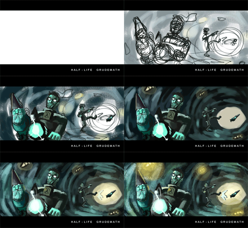
So, in an effort to shed a little more light on the Grudemath sketches, here are a few time-lapses of the two most recent speedpaints. Keep in mind that these are meant to be as quick as possible -- the Episode Two one, for instance, took me about 75 minutes. Moreover, both of these are heavily influenced by
Ashley Wood, which contributes a little bit of comic book dynamism. Hopefully, this will be useful to somebody out there.

I was having trouble thinking of standout moments from the second half of the Episode One run. My first idea -- seen here briefly at the beginning -- was sQuiz being accidentally headshot by Alyx during the final mission. I roughed it out before deciding I didn't like it, but I was drawn to the train station as a general setpiece. So I decided to stage a straight-up action scene, and I made it a personal challenge to make it look like a frame out of a graphic novel.
As you can see, I start with a simple sketch that's extremely rough -- most of the idea is still in my head at this point. My main goal here is to establish main lines of action, dominant shapes, and a general sense of proportion. After that, I splash in a few rough colors underneath to guide the painting process. Here I took a cue from the actual art direction of Episode One, which employs a lot of warm tones.
From there, I just build up the primary figures and background elements with the hard round airbrush. After several passes of adding detail, I move on to a global layer for finishing effects and texture brushes. I also throw on a yellowish splatter texture at the very end, which is not too different from what
Gabe is doing nowadays.

The concept for this sketch was easy because sQuiz told me exactly what to include. Notice that the composition conforms to the standard foreground-to-background scheme I've used for the majority of the Grudemath pics. I've found that it's usually the easiest way to add interest to some kind of interaction or comparison. (Or maybe I'm just lazy.)
Again, I start out with an extremely simple sketch. I also cheated a bit by color-picking from this
screenshot, which incidentally was also a very useful reference for the gnome. From there on out, it's a pretty straightforward process of building up the figures, adding lighting effects, and laying in some texture.


